A Complete Guide to Twitter Banner Size: Examples, Tips, Benefits, and More
We live in a digitally evolving landscape where the first impression can make or break the connection, and your Twitter banner is your golden ticket to creating a visually striking impression. Picture this, millions of users are scrolling through the endless content stream, yet your profile stands tall with its unique voice. Consider it a billboard for your brand to showcase its personality and message, and to do so correctly, you must master the perfect Twitter banner size and design tools. In this blog, we’ll talk about Twitter banner dimensions, nuances of impactful designs, and how they can wield success for your brand. So, let’s jump right in!
What is a Twitter Banner?
 A Twitter or X banner is the big picture displayed at the top of your profile. It covers the entire page width and acts as a visual representation of your brand or personal account. Contrary to the profile picture, which is small and doesn’t move, the banner provides ample room for creativity, messaging, or enhancing the appearance of your profile. It is a place where you can express yourself creatively and in a way that speaks to you.
What Size is a Twitter Banner?
 The social media site recommends a background image size of 1500 pixels wide by 500 pixels tall to ensure that it is visible on all devices, including smartphones, tablets, and computers. These are the key points that you need to take note of:
- Twitter Header Dimensions: 1500 × 500 pixels
- Twitter Cover Photo Size: 5 MB
- Supported Formats: JPEG, PNG, GIF (although animated GIFs are not supported as banners)
- Twitter Banner Aspect Ratio: 3:1
By using the recommended size and resolution, it is ensured that your profile background will look crisp and clean on all devices. Now that you’ve understood this, let’s go ahead and look at the steps to upload your background image on X (formerly known as Twitter).
How to Upload a Twitter Header?
Once you have the header image of the recommended size, you can then post it on your profile. Thankfully, Twitter has a built-in compression system that can fit your image correctly if the image ratio is not up to the mark. Here’s how to upload Twitter background image:
- First, launch the official website on your device and go to your profile section.
- Tap on the Edit profile button, and you’ll be redirected to a new page.

- Here, tap on the little camera in the header space and find the image on your device.

- Drop the header photo, then drag the slider to fit the image to its position.
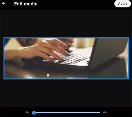
- Click on the Apply button. Boom! Your banner photo is posted.
Note that no cropping would be necessary with the slider if you already have the image that fits Twitter’s recommended size.
Benefits of a Well-Designed Twitter Header
A well-designed Twitter header can significantly boost your profile altogether and make an impact on the viewers. Here are all the benefits of having a proper Twitter cover photo size with a clean design:
First Impression
Your cover photo is the first thing a viewer notices when they visit your profile. It is your best chance to convert them into your audience. Having a visually appealing banner will make a striking first impression, encouraging them to stay longer and watch out for your other content.
Professionalism
Having a banner that corresponds to your business conveys professionalism and allows visitors to focus on the details. Whether you are a person, a small business, or a large corporation, a professional banner increases your credibility and trust.
Creates Awareness
Use your Twitter banner as an opportunity to reinforce your brand’s identity. You can utilize the space by combining logos, services you offer, colors, and taglines to build brand recognition.
Boost Engagement
An imaginative and visually appealing banner can attract the interest of the viewers and ignite curiosity. This as a result can boost your engagement levels including likes, follows, retweets, and profile visits. A captivating banner will prompt the users to discover more about you and your brand.
Conveys Information
Your banner can effectively communicate critical details like upcoming events, promotions, or new product releases. This could be especially beneficial for companies trying to convey important messages or tell a story to their target market. A thoughtfully designed Twitter banner not only enhances your profile aesthetics but also acts as a tool to attract and engage with your audience. Moving ahead, let’s look at the best ways to design your header image in the next section.
Tips for Designing Your Twitter Banner
Creating a Twitter banner isn’t just about uploading a high-resolution image, you need to understand what will attract the viewers and the basics of Twitter background dimensions. Let’s look at some design tips here:
Alignment
Twitter’s layout shows your profile picture along with your banner. If you do not wish to hide the important elements of your image, it is recommended to avoid placing crucial information or visuals in the bottom-left corner, where the profile picture is displayed. This designated area must be taken into account during the design process to ensure essential elements remain visible.
Consistent Branding
What makes a few brands stand out from the crowd? – Consistent branding. Make sure that your banner on X matches your brand identity when using the platform for business or personal branding. Utilize your brand’s colors, fonts, and imagery to achieve a consistent appearance on all your social media accounts. This regularity enhances the identification of the brand and its level of professionalism.
Color Balance and Composition
You must use the right colors that go well with your brand’s identity. Moreover, try to keep the design minimal yet effective. This way you will be able to capture more eyes.
Use Your Creativity
Think of ways to stand out from the crowd. Try out distinctive patterns, creative components, and striking images to attract interest. Consider what sets you or your brand apart and showcase it in your banner. These are the points you should take note of when designing the perfect banner for your X account.
Pitfalls to Avoid When Designing Your Twitter Banner
When creating your Twitter banner, it is crucial to steer clear of typical mistakes that may reduce its impact. Here are a few errors to be mindful of:
Not Paying Attention to Safe Zones
Placing the right info in a particular area helps to get more retention. Make sure to find out the safe zones that do not interfere with your profile image.
Overcrowding
We tend to provide as much info as possible at first glance, but that is wrong. Avoid filling up your header with too many pictures and text. A cluttered design can be overwhelming for the viewers.
Low Image Resolution
Utilizing low-quality or blurry images can give your banner a less polished appearance. Make sure to always utilize top-notch images to guarantee that your banner appears crisp and well-defined.
Poor Branding and Irrelevant Image
Failing to include branding elements can result in a disconnected appearance throughout your social media accounts. Make sure your banner is in line with your overall brand’s identity. Additionally, utilizing images that do not align with your brand or message may lead to confusion among visitors. Select images that truly reflect yourself or your company. So these are the common mistakes that you must avoid, and you’re good to go.
Final Words
A neatly designed banner isn’t just a decorative element, but a powerful tool to attract an audience and drive more traffic. You will undoubtedly strengthen your online presence by using the optimal Twitter profile banner size, an intuitive and clean design, and the appropriate form of pictorial display and typography. So this was all about Twitter banner sizes, and how to design the image and upload it. We hope this blog will guide you in the process. Please share it with other X users as well.
Frequently Asked Questions
Sources:


