Designing a website while retaining all the things that do not contribute to a terrible design may be a time-consuming effort. However, having a decent website design is essential since it has a significant influence on SEO (Search Engine Optimization). SEO is non-negotiable since it helps a website rank high in search results and what you will do with a website that has no users.
A major error that businesses make when creating a website is ignoring its design, despite the fact that it is the most significant aspect in retaining visitors. According to a poll, 57 percent of respondents agreed that they would not suggest or visit the badly designed website again. That’s a big number, isn’t it? Every single customer is vital to a startup or an established organization, and losing 57 percent of them will not contribute to your business growth.
You can easily find popular websites with bad designs on the internet. Taking inspiration from design blunders they have committed, the following are seven factors that are frequently overlooked while creating a website:
1. Website Not Being Responsive

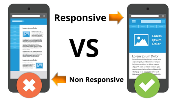
Many times, the responsiveness of a website is misunderstood with its ability to respond to every action taken by users. However, this is not the case; a website is called responsive when it adapts according to the screen size of various devices. In other words, the website should preserve its design by altering its element’s properties and their placements according to the multiple screen sizes on which it is viewed, while also being functional and effective.
The responsiveness of a website is very important in SEO. and Any good SEO service provider will emphasize this factor because the search engine favors and ranks responsive websites higher in search results. If your website lacks this functionality, it is never going to appear on the first page of search results.
2. The Slow Loading Speed Of The Website

Would you wait for a website that takes forever to load? No, no, no! You will just navigate to other websites that are there in search results.
The same is true for any other user who is browsing the internet. No user can endure more than 2 seconds for the page to load. If it does not load within that time, they just hit the back button and move to another website. Furthermore, they are less willing to revisit that website.
Now, if the search engine notices that consumers are losing interest in a certain website due to its slow loading time, it will undoubtedly rank it lower, since user comfort is of the utmost significance. Therefore, slow loading speed is another one of the top website mistakes to avoid.
3. Broken Links on the website

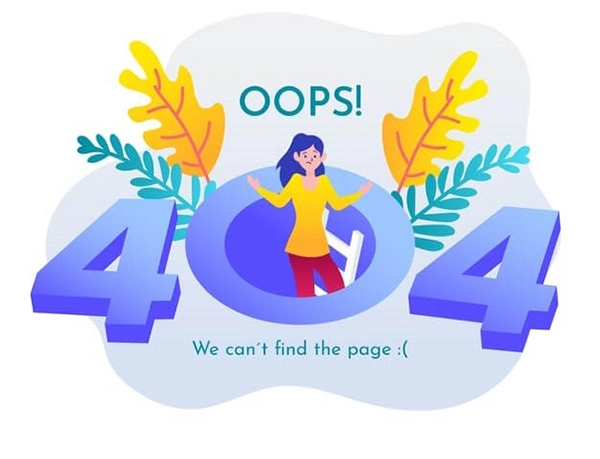
Another website error that irritates consumers is the existence of numerous broken links on the page. Pages that no longer exist and generate 404 errors are instances of broken links. If a person visiting your website clicks on a link and is routed to a 404 error page, they will leave in seconds and never return. For the same reason, websites with a substantial number of 404 errors are less likely to rank high in search results.
4. Not having a favicon

Not having a favicon on every page of the website is another one of the most important things to avoid when creating a website.
Favicons are little symbols that show alongside the title of a webpage; they are often website logos. These are useful because when a user has many tabs open at the same moment, the title of the page remains no longer visible. Then, the only identifying feature of the website that remains is its favicon. But when it’s not there, as a result, users will be unable to identify your website, and ultimately they are less willing to revisit, raising the bounce rate.
5. Homepage with carousels
Another website design error to avoid is having the homepage of the website with automatically rotating carousels of slides. Moving carousels diverts customers’ attention away from the core objective of the website, frustrates them, and thereby directs you away from your conversion goals.
6. Inadequate Typography
Typography is the type of text style used on the website. There are several factors on the basis of which the font style for the website are decided, listed below are some of these:
- Readability: The font should be clearly readable. It should not be too fancy or too bland.
- Serifness: There are two majorly used font families, Serif and Sans-serif. Text in heading and subordinate paragraphs should not have the same font family.
- The number of font styles: A sleek and modern website uses the utmost 2 font styles. A lot of font styles used in a website looks cumbersome and distracting.
7. Insufficient White Space
White space is the area of the web page that it takes up. Adequate white space is required to make all items visible and to give consumers enough time to ingest all available information. White space allows the user to focus their attention on each component without being distracted, which improves readability and their focus on the main objective and services offered.


